
Strengthening the online presence of the European University brand
Client
- Universidad Europea
Industry
- Education
Skills
- Visual identity design
Team
- Product designer
Date
- 2021
Boosting the university's digital image
The European University, constantly changing and committed to technological innovation, found the need to evolve its new branding to create digital assets.
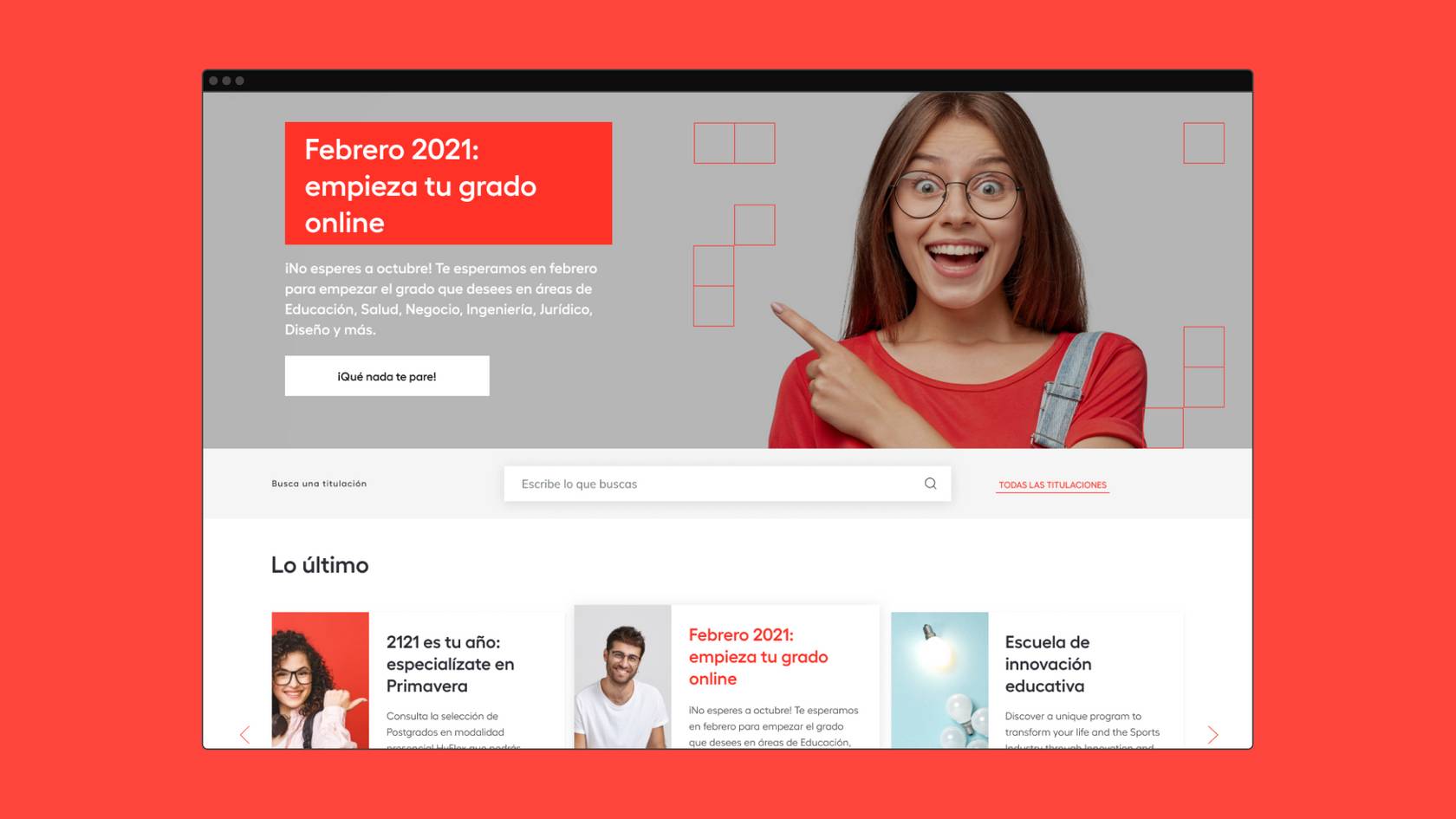
In January 2020, the European University published a revamped version of its corporate website. In parallel to this work, which ran throughout 2020, a rebranding project was carried out. As both projects happened in parallel, there was some dissonance between them.
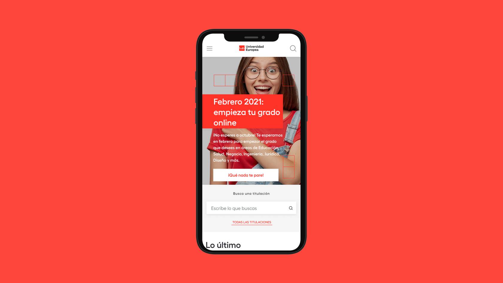
Universidad Europea faced the problem of not being able to find a correct application of the brand in the web context. In general, it encountered problems when it came to extending them to the different responsive jumps and applying a style that is demanding in terms of dimensions in small spaces.
This is where Secuoyas and its team came in, ready to take on the challenge with the aim of creating a digital experience that transmits the brand identity and values of the Universidad Europea.
Understanding as a starting point
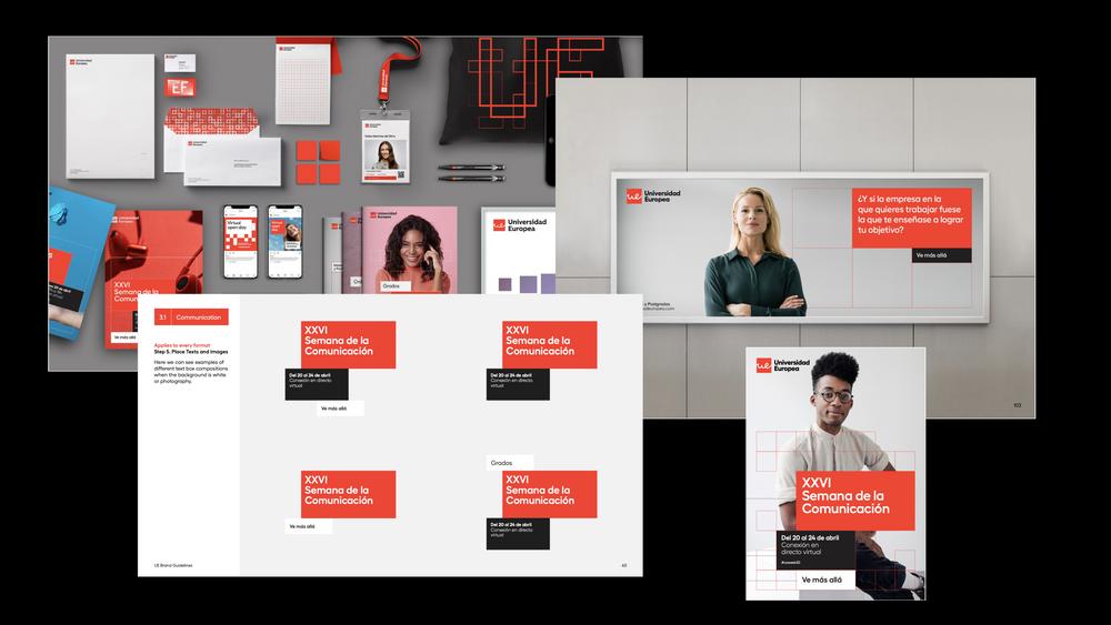
Before embarking on the task of bringing Universidad Europea's new brand identity to digital assets and given that different players had come into play in the various projects launched by Universidad Europea, the first thing we had to do was to analyse the starting material in order to be able to carry out the brand adaptation.
We spent time and effort in thoroughly understanding the essence that the university wanted to convey with the new identity, reviewing the brand manual in detail to see how we could apply that image in each module designed for the new website.
This analysis was aimed at maintaining consistency and brand identity across all brand applications, a need that they had so far failed to achieve.


Investigating different visual lines
In our work to achieve an effective branding application for the Universidad Europea, we carried out a process of research and experimentation with different visual lines for the different modules of the website. Our goal was to find a solution that would reflect the identity of the university and offer a visually appealing experience for users.
We created initial concepts that ranged from more minimalist and clean designs to approaches with more elements, always keeping in mind the basic elements of the brand and the geometric shapes, such as the square, which were the identifying part of the identity. We evaluated the usability of each approach, its visual impact and its coherence with the identity and values of the Universidad Europea.
In addition, we worked closely with the university leadership to ensure that each proposed visual line was aligned with their strategic vision and stated goals. We maintained constant communication, sharing our research, concepts and receiving feedback.

The student as the main protagonist
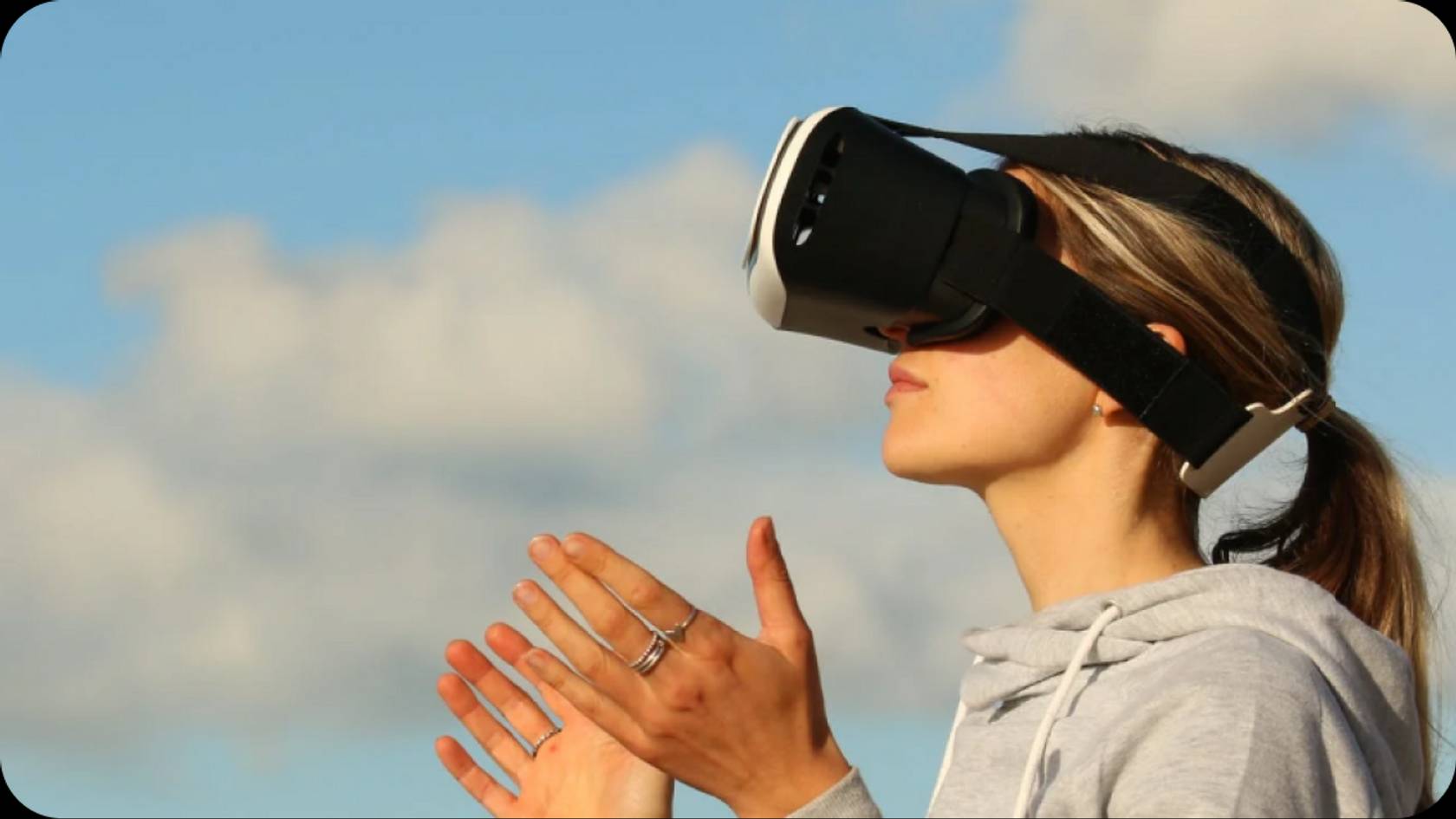
Another of the aspects we had to pay special attention it was the photography and image curation, since brand guidelines defined that real photos of students should be one of the main elements of the identity.
Therefore, we made an effort to curate the images that were coherent with what Universidad Europea wanted to transmit, such as optimism, positivism, minimalism and innovation, and that were in special harmony with the rest of the elements.




Applying the visual lines in the different modules
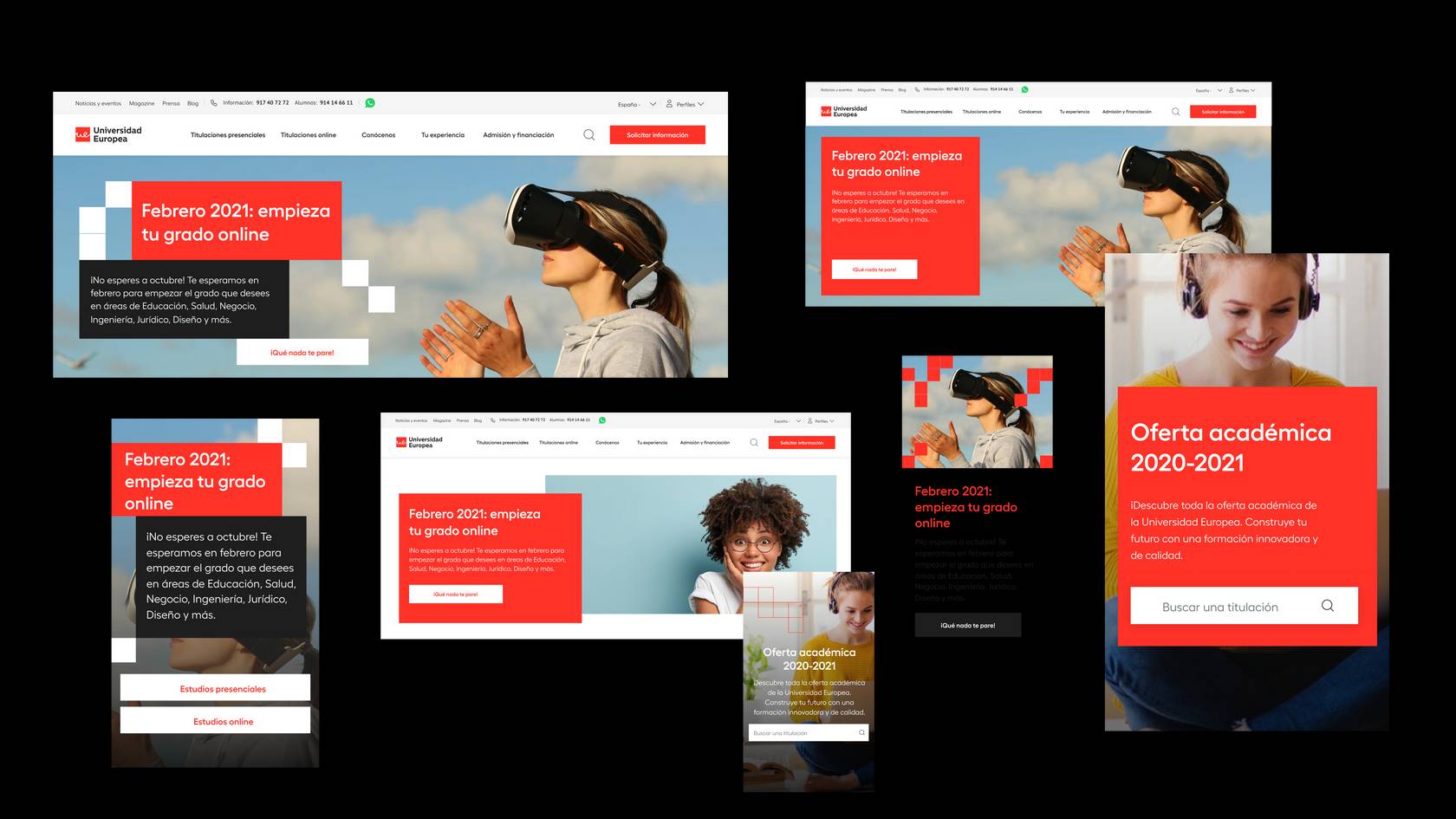
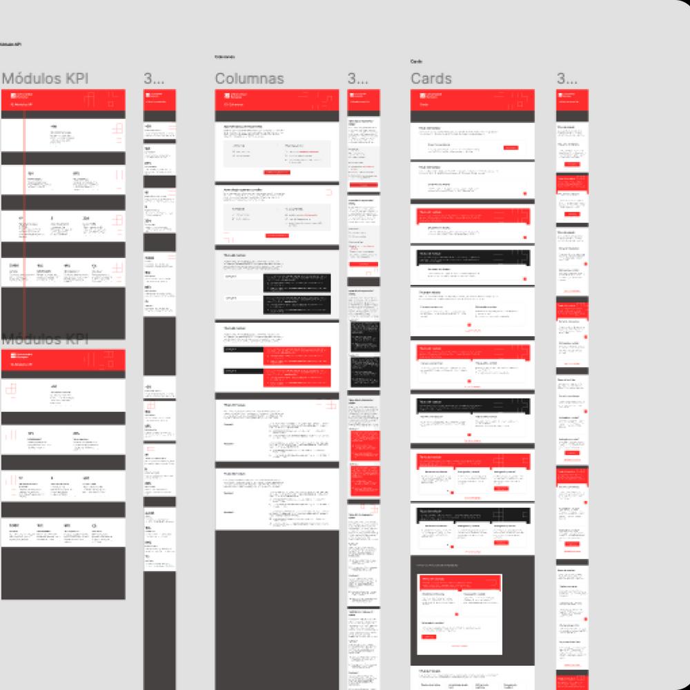
Once we had selected the visual guidelines, we moved into a phase of intensive work to create different versions of each module. Here we were presented with a major challenge, as we had to accomodate for branding guidelines without detracting from the user experience, ensuring visual consistency throughout the site. For each module, we explored different design variations including content layout, visual hierarchy, colours, fonts and interactive elements, and each version was carefully evaluated to ensure usability, accessibility and consistency.
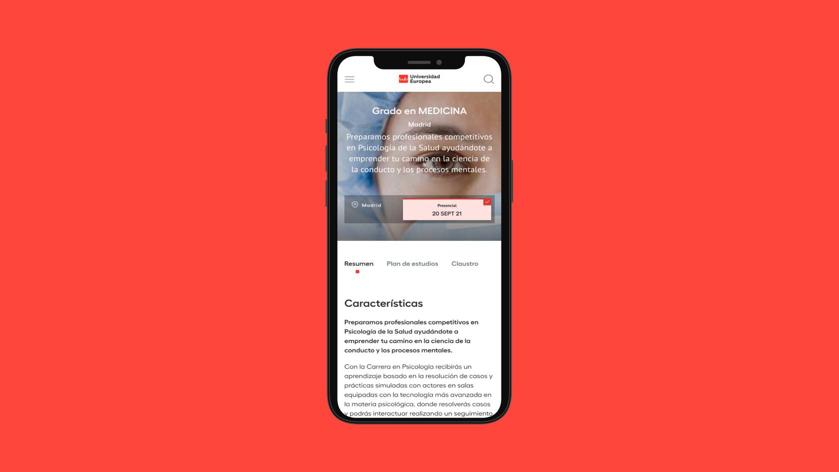
During this process, we also worked on adapting the different modules to different devices and screen resolutions. We considered the user experience on mobile devices and made sure that each module was responsive, adapting seamlessly to different screen sizes.
Bringing the European University brand to email distribution
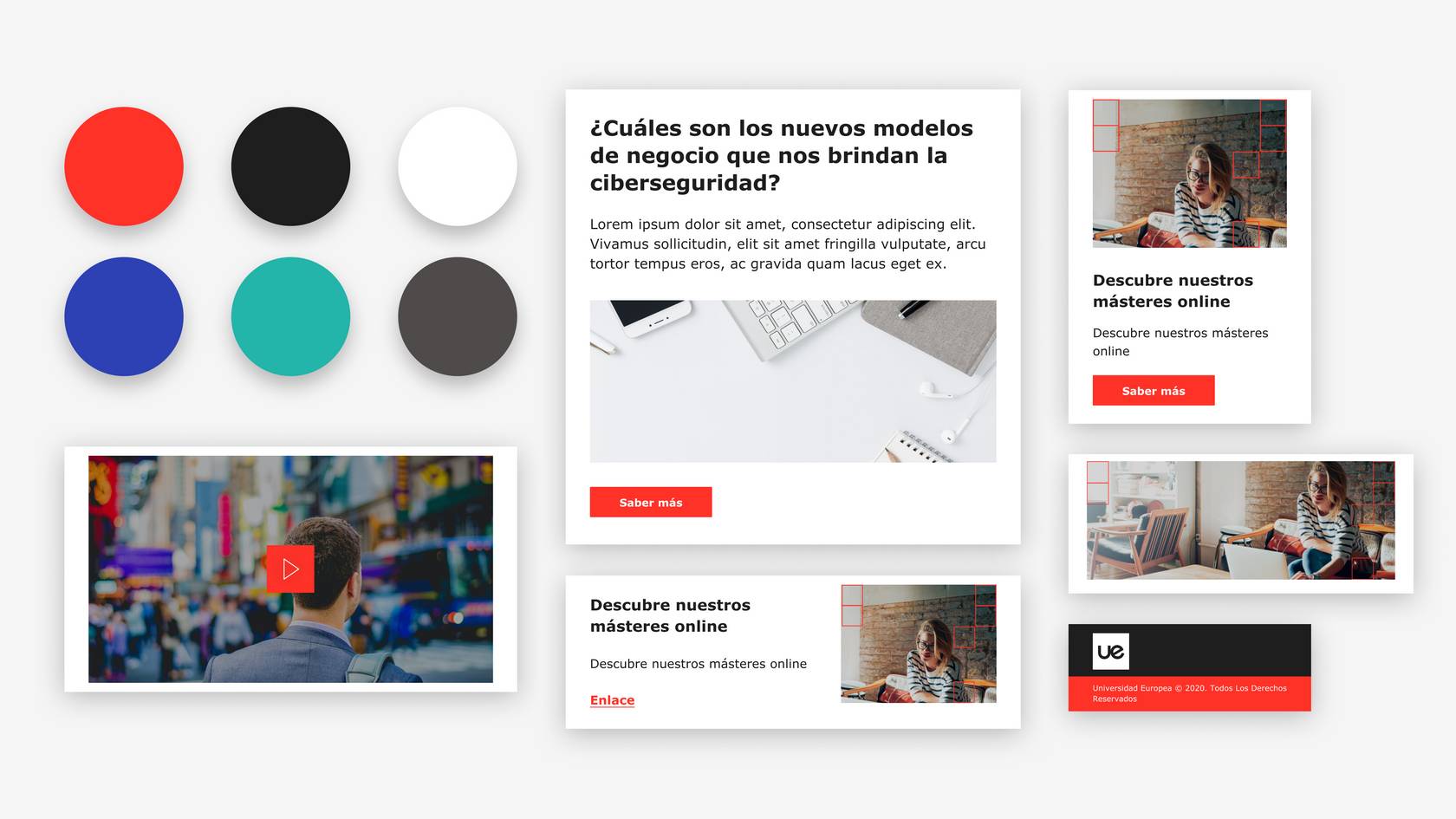
In addition to updating branding on the website, we also carried out a brand adaptation for Universidad Europea's emailings. Recognising the importance of email communication as an effective tool for reaching out to the university community, we strived to ensure that each email consistently reflected the brand identity.
We worked closely with the university's marketing team to understand their objectives and ensure that each email reflected the image and values of the institution without losing the objective to be communicated.
We were also in constant collaboration with the development team to ensure the technical feasibility of our proposals.

An optimal result
The result of our work has enabled the European University to have a coherent and consistent global presence. The updated digital assets have strengthened the brand identity and provided an exceptional user experience.
It was quite a difficult challenge to achieve, with many limitations but Secuoyas proposal covers all our needs: the brand is identified and the good usability we had achieved is maintained not having to redevelop the existing modules.
