Saddle was born with the challenge of building a singular gastronomic experience from the ashes of the iconic Jockey, the former restaurant of reference for Madrid's Jet Set. After five years with closed doors, it revives the dream of returning to the scene to shape an elegant and timeless experience.
Client
Saddle
Industry
Restoration
Skills
Research
Visual identity design
Team
2x Product Designer
Date
2021
An increasingly crowded gastronomic offering
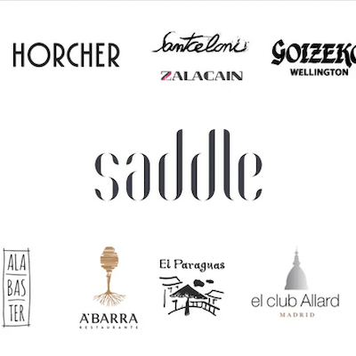
The centre of Madrid is becoming one of the great centres of the national restaurant industry. In addition to the well-known Horcher and Zalacaín, new flagship restaurants have been added for the most discerning gourmets.
Copious competition
As a result, the competitive space in the restaurant sector is becoming increasingly complicated. In this context, ensuring that a new restaurant has a differential image entails the need to know in depth the value proposition and experience of the other restaurants, as well as the characteristics and attributes of the Madrid gastronomic scene. Likewise, Saddle's aspiration was to recover from Jockey that cosmopolitan and wealthy public, so the scope of study was extended to the most reputable international offers.
The research we carried out revealed some important junctures. In the first instance, it showed us that, when selecting a venue, two factors are taken into account: its location and interior possibilities. And finally, it is on the basis of the first concept that the final proposal is built.
On the other hand, we also discovered that brand identity, in most quality restaurants, is based on 3 pillars:
A distinctive, signature cuisine, with an excellent product and a professional team.
An architecture that structures the whole experience, linked to an interior decoration that surprises, in which all the details are well cared for, both in terms of presentation, lighting and sound.
Exquisite table and bar service, in which the layout and service are excellent.
Last but not least, we found that the investment in resources and the level of detail required was such that other key elements such as branding and the exterior tended to take a back seat.
For Saddle, this was not an option, so we tackled the problem holistically.
The starting point
The concept behind Jockey was, inevitably, the starting point on which we had to build the brand identity. Moving away from the Jockey halo was not going to be easy, and considering the positioning of the venue, it was much more logical to build on that. So we knew we had to start building on the idea of excellence.
We worked hand in hand with Carlos Jimeno and Dani Fernández, great professionals in communication strategy and expert influencers in the gastronomic space. Together with them, we started the project with multi-disciplinary workshops.
We also had the experience of the architect Diego Gronda and the Brandelicious team, which allowed us to better define the concept behind the project.
Creating the identity
We distilled many hours of analysis. We reviewed all the information and synthesised again, simplifying until we were left with the most essential. From a still very eclectic perspective, we connected concepts and components that were building the foundations of the experience. We chose more perceptible and visual factors, which allowed us to identify Saddle as a whole, as a continuum.
Lighting, space and sound were the elements selected to create the desired ambience within the restaurant. The combination of these three factors made it possible to generate an atmosphere capable of adapting to the different times of the day and making the dining experience unbeatable.
The use of configurable movable panels was Saddle's bet to play with the distribution of the space and to obtain different reverberations of the ambient sound. And the play of lights, which would complete the expected result.
Given their importance, we decided to capture the essence of these elements to define the graphic style of the brand.
The new luxury
Within the framework of the project, it was necessary to rethink the concept of the new luxury. Each individual has a different perception of what luxury is. For a billionaire, luxury is time. In Japan, luxury translates into space. For our target audience, luxury is a journey towards relaxation.
A day without a diary. No mobile phone. Disconnect in all senses. No fuss. Transparent. Without pomposity. **No "NO", but a real "NO".
A clear homage to the legendary restaurant
"Saddle", in equestrian terms, means "mounting saddle", a clear homage to Jockey, the most frequented venue on the Madrid scene in the 60s and 70s.
It is characterised by being a traditionally innovative concept, and that same spirit can be found in the classic saddle of the prestigious brand Hermes. A saddle that has served as inspiration for the brand, where every detail is taken care of to the millimetre, and its elegance makes it look almost like a piece of design.
Hermés as a reference
From the measurements to the first trot, Hermes craftsmen meticulously adapt the product to the different morphologies of horses and riders. Only natural raw materials are used, and craftsmanship, elegance, tradition and quality are the ingredients to create the design.
The synthesis
In the logo, the negative space is as important as the forms. The text becomes almost sculptural. And the typographic components are shaped in a modular way, structured as panels that generate an indivisible thread with the interior architecture.
We visually tangibilise the narrative we have been constructing: the sinuous forms of the Hermés chair, the configurable panels of the space and the waves in the reverberation of sound are reflected in each of the letters.
The concept crystallises
The rest of the visual identity is built on the ideas of excellent service, subtlety and sophistication. We developed a graphic universe based on guidelines, colours and rules of composition in order to make it distinctive and recognisable without the need for a logo.
We also deconstructed the physical elements with which we were going to interact during the table experience, extracting the purest forms: circles. The circular shapes have allowed us to develop an experience that avoids staticity, evoking a dynamic and perfect service.
A explosion of details
Although branding does not play a major role in the restaurant sector, at Saddle it was clear to us that it was going to be the guiding thread of the business, extending to all of the restaurant's points of contact.
Offering good service was not enough. Saddle's public was going to value many other elements that revolve around the experience of the premises: the presentation of the restaurant menu, the music, the treatment and image of the employees... And all of them make up the intangible and personal value of the brand, allowing us to connect with it.
Diners have a front stage service experience, but the backstage of the restaurant is made up of a multitude of suppliers and workers. To provide an excellent service means having an impeccable image at each and every point of contact: from the advertisement to the invoice, from the order email to the letter of credit.
The successor to the excellence
The bar for Jockey was set very high and we had to make a big leap in quality to regain the greatness and longevity of Jockey. It has taken two years of complete renovation for Saddle to see the light of day. And we love the result: elegant, original and with character, just like the restaurant itself. Saddle is the birth of a restaurant concept that doesn't exist in Madrid, and it promises to become the new meeting point for society's finest. "The new luxury of classic cuisine in Madrid " | Expansión "A resounding commitment to flavour without losing elegance " | Status, elEconomista "The new classic table you have to sit at " | GQ Magazine