
Griddo consolidates and evolves Comillas' digital ecosystem
Industry
- Education
Skills
- Information architecture
- Product development
- Research
- Visual design
Client
- Universidad Pontificia Comillas
Team
- 3 x Product Designer
- 3 x Front End Engineers
- 2 x Content Strategist
- 1 x Project Manager
Date
- October 2023
Context
The higher education sector is experiencing one of the greatest moments of change and transformation in its history.
The constant opportunities that emerge from the unstoppable digitalisation, the demands of a completely new student... are just some of the factors that require the university to keep up to date in order to continue to differentiate itself through its search for excellence, its key position in society and its educational proposal for the future.
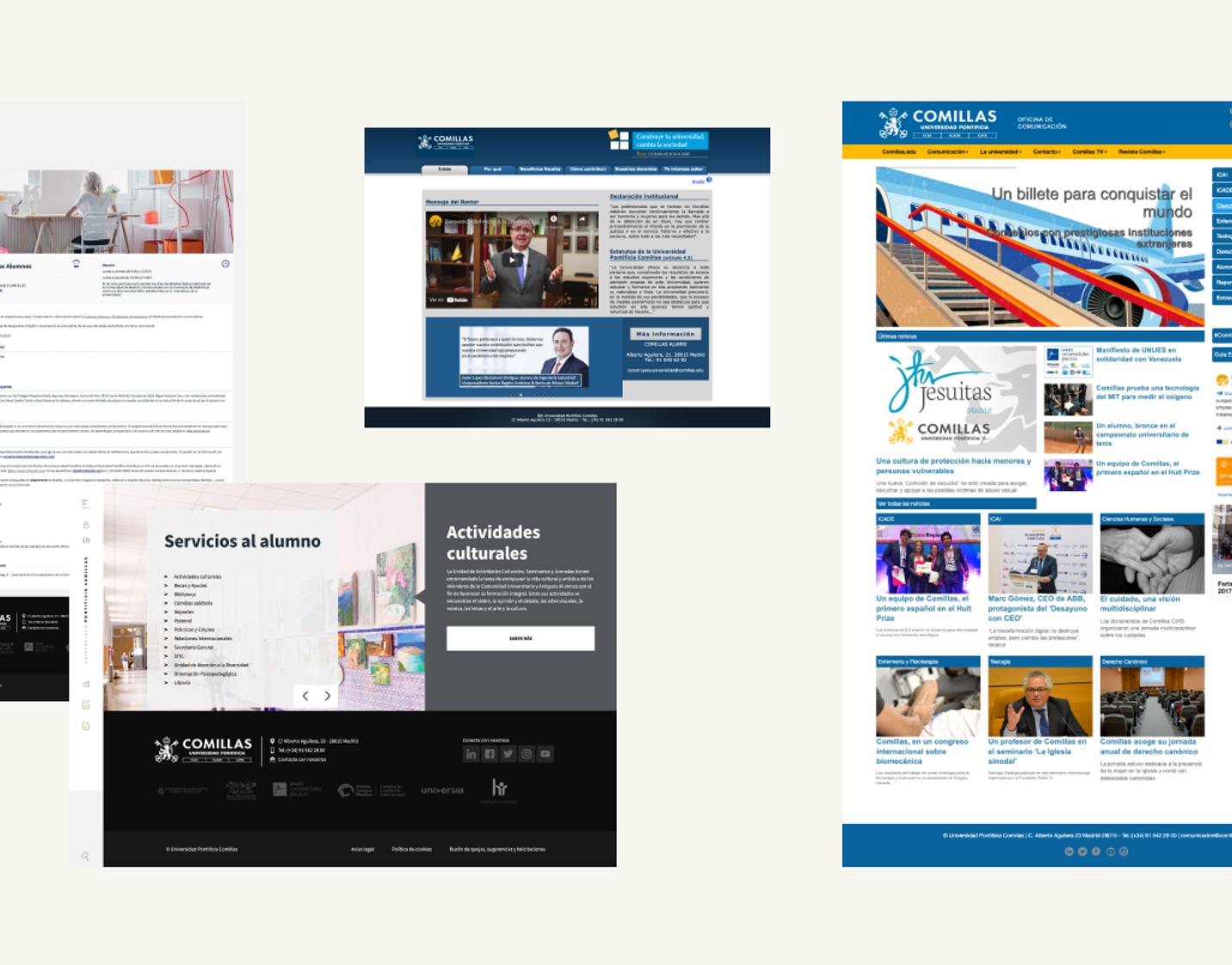
Comillas Pontifical University, aware of this new scenario, yearned for the need to adapt its institutional website to the new reality, both in terms of visual consistency and improvement of navigation and conversion flows, identifying the need to have an ecosystem capable of bringing together all its digital assets in a coherent and consistent way to its identity and its position in the Higher Education sector.
To address the challenge, it was necessary to carry out an extensive design process, based on quantitative and qualitative data, which would not only guarantee a successful digital transformation, but also allow the identity, representation and visibility of all the Institution's brands and sub-brands to adapt to the new challenges of the market.
12
Months of collaboration
Working closely with Comillas' team has been vital to ensure that timing and quality goals were met.
16.218
Pages analysed
After an arduous work of analysis, revision and reorganisation of the information, we synthesised the content into 3,894 pages, achieving a 75% reduction.
47
Modules
Modules can be combined, rearranged and adjusted to any device or screen, achieving a fresh, modern and elegant result.
8
Integrations
Allowing all the work of the marketing team to be managed from a single tool, without any technological dependecy.
The power of participation
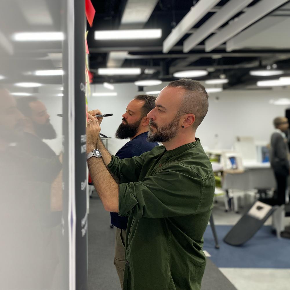
We rely on multiple tools and dynamics to extract the insights allowing us to define the ideal roadmap. We conducted interviews, surveys, focus groups, heuristic analysis, web architecture mapping, flow optimisation, card sorting workshops, tree tests, GA analysis, analysis of session recordings, heat maps, benchmarks... whose results are presented and discussed in workshops with a necessary and varied set of profiles of the Institution, in this case, in its magnificent Comillas Lab.
The constant updating of progress to stakeholders has allowed to build a relationship of mutual trust, collaboration and support for the decisions taken throughout the project as they were supported by the insights of the previous research phase.
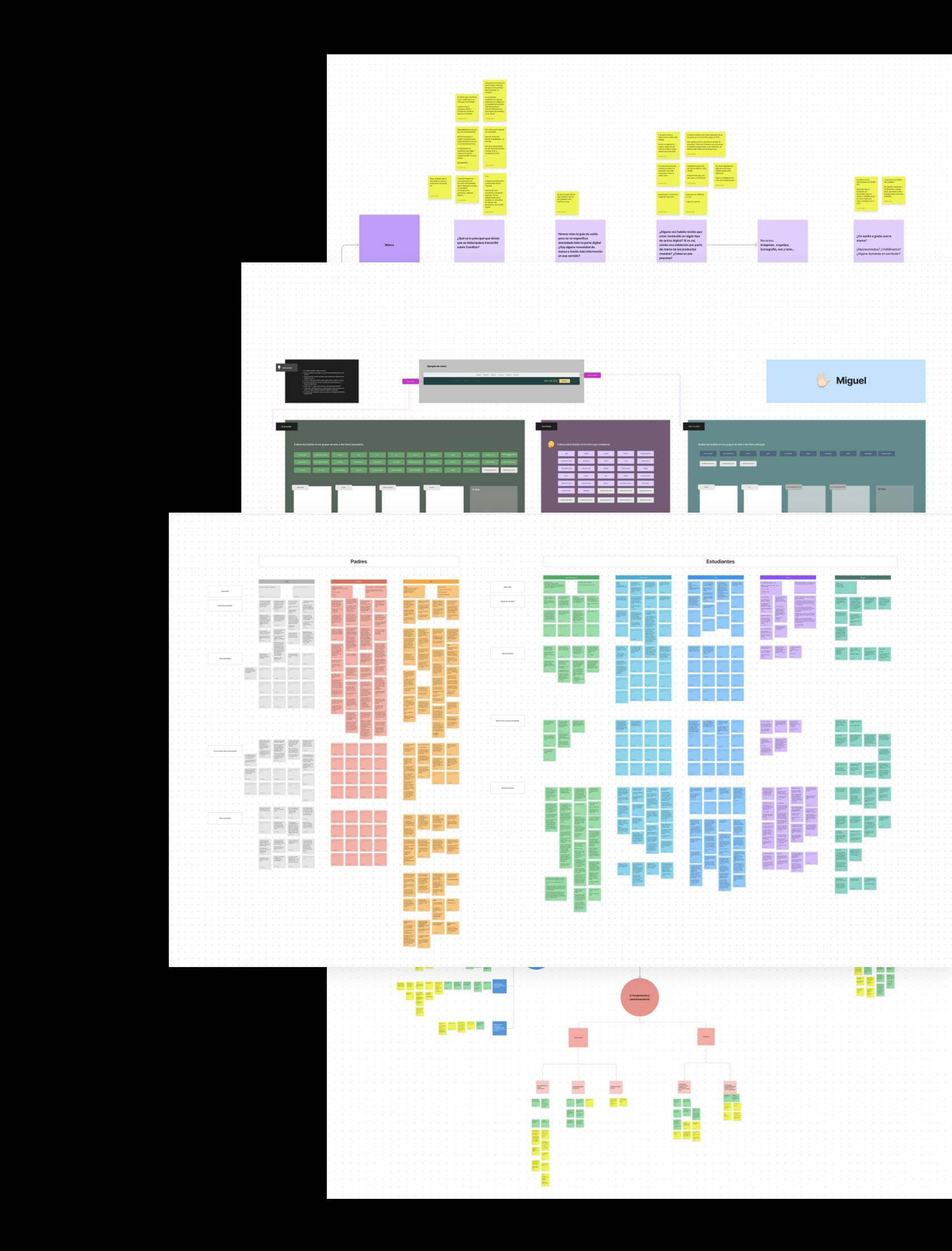

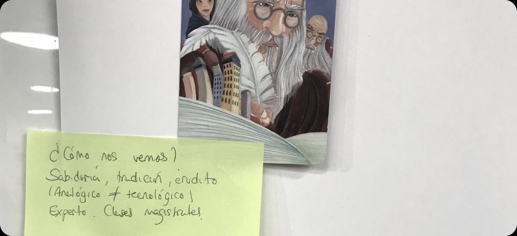

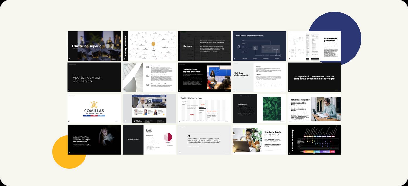

After having the first sessions with the stakeholders, external users and internal users, we had the following findings:
- Stakeholders were not comfortable with the content management system (CMS) and the outdated perception of Comillas as an Institution. Despite its growing commitment to educational innovation, this was not consistently reflected in the University's digital showcase.
- External users, such as prospective students and their families, found it difficult to find information on the website, which increased the risk that they would abandon the site and/or overuse the contact channels.
- Internal users - including professors, deans, rectors, vice-rectors, current students and alumni - also faced problems navigating the website and lacked guidance in creating content, resulting in major visual and hierarchical inconsistencies. In addition, they had diverse needs that varied from department to department, demanding more equal representation and greater visibility in specific areas.
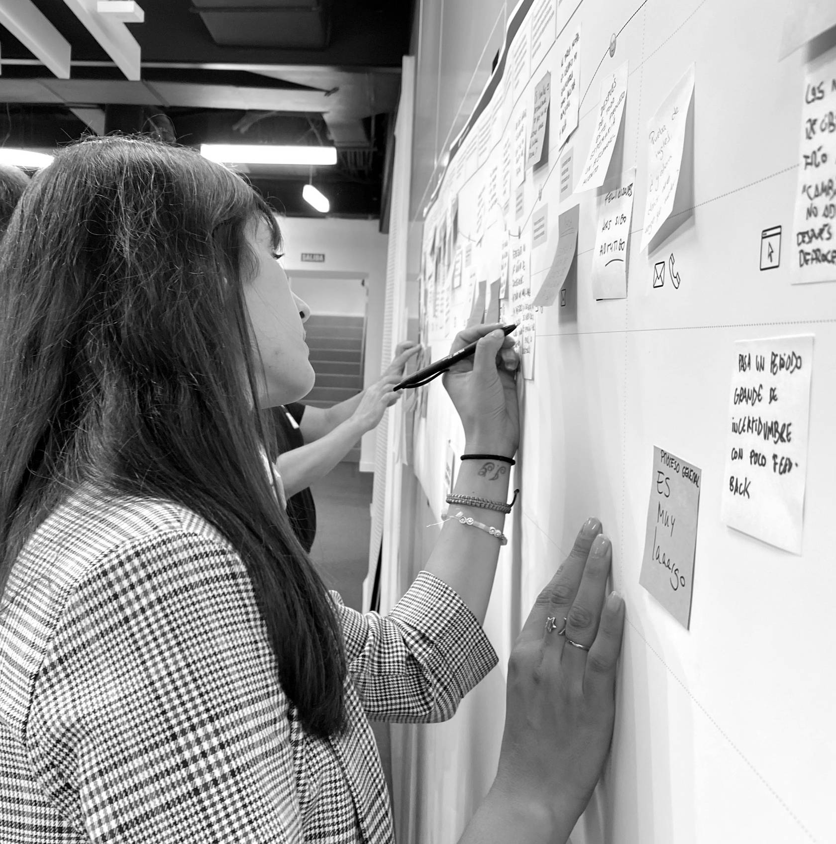

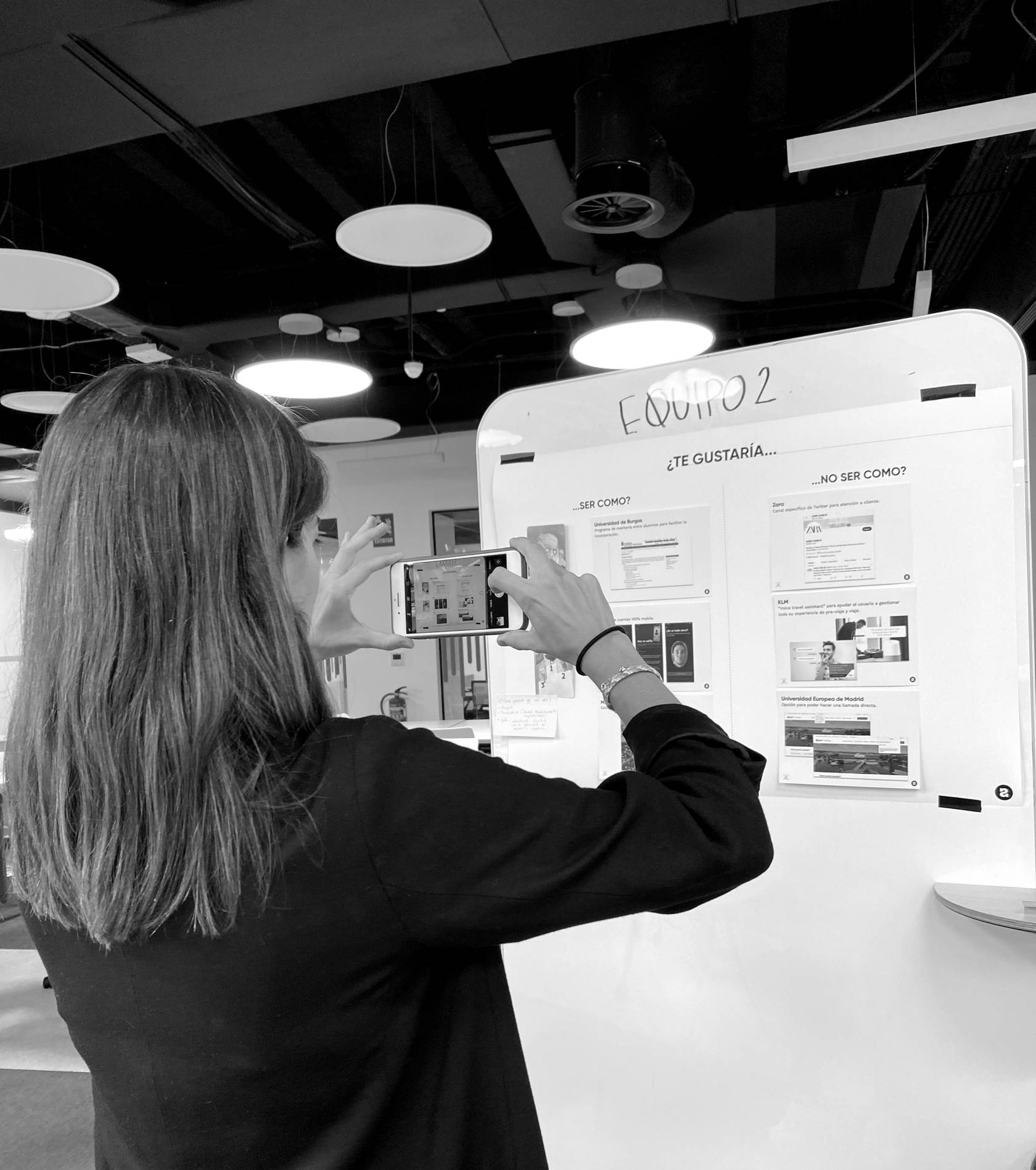

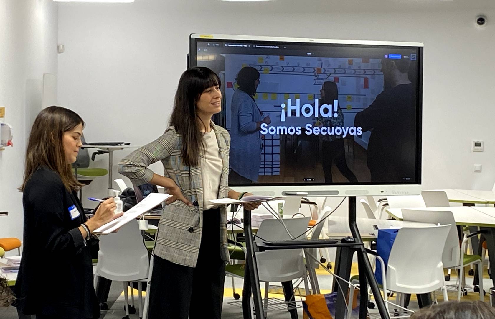

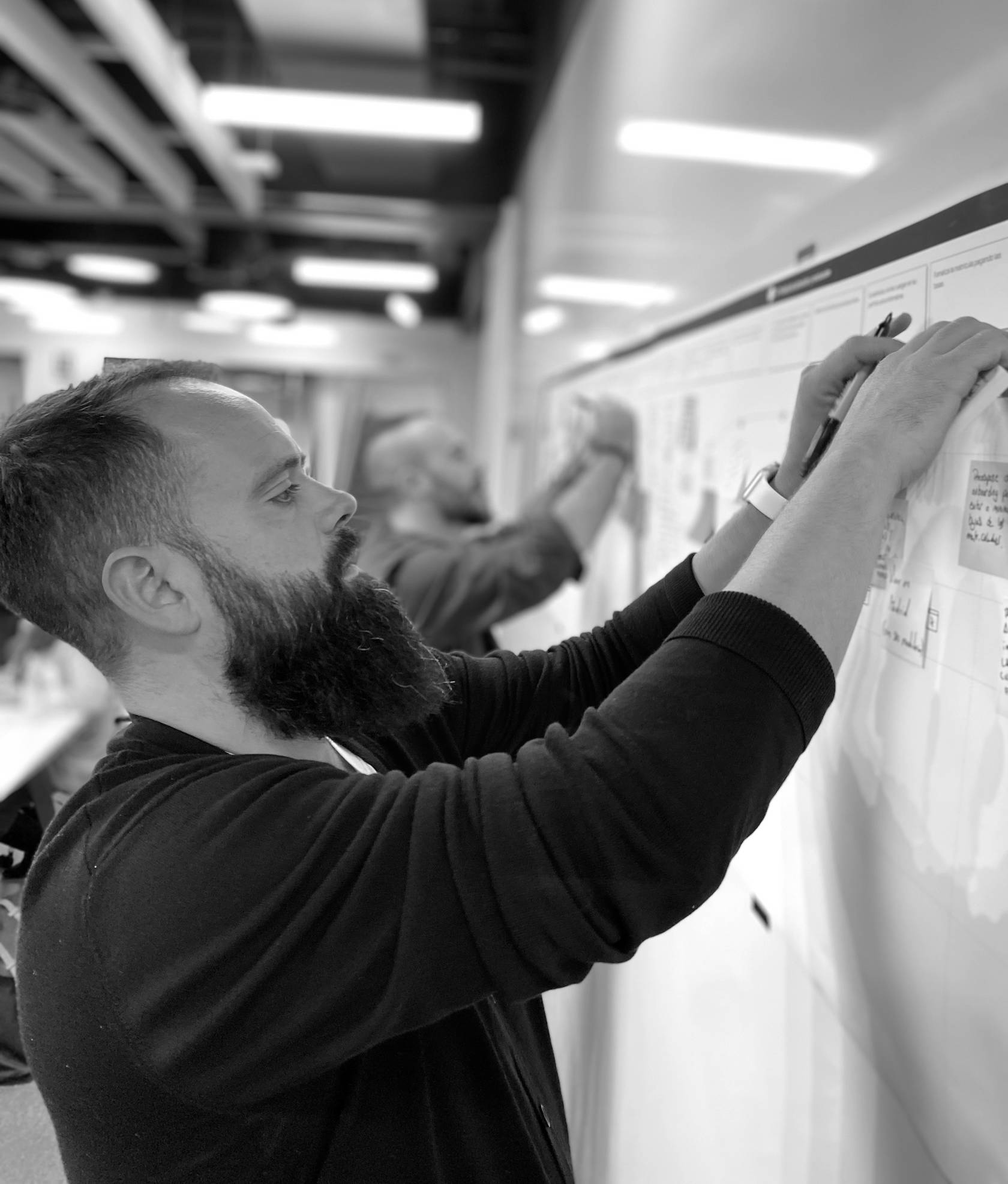

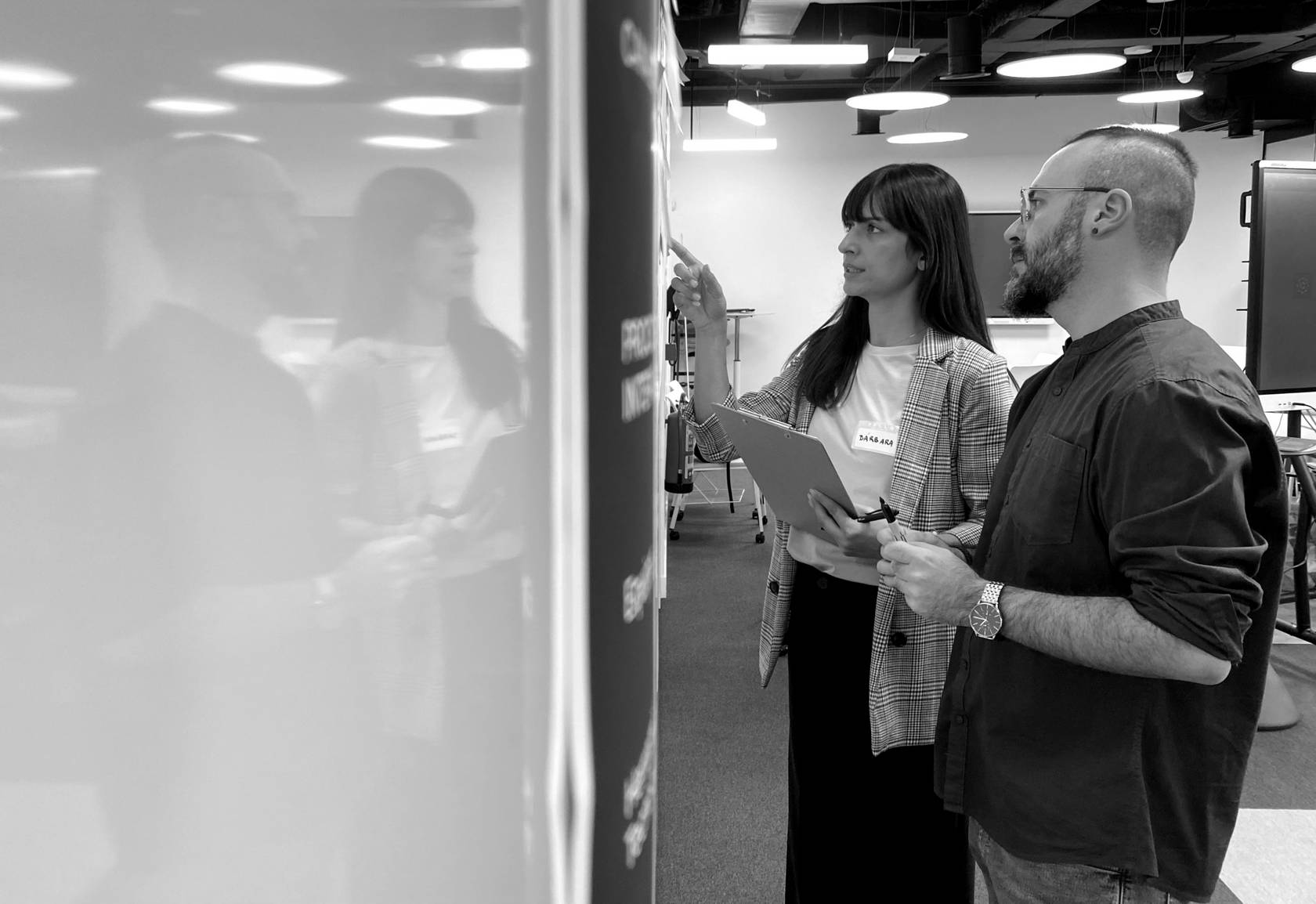

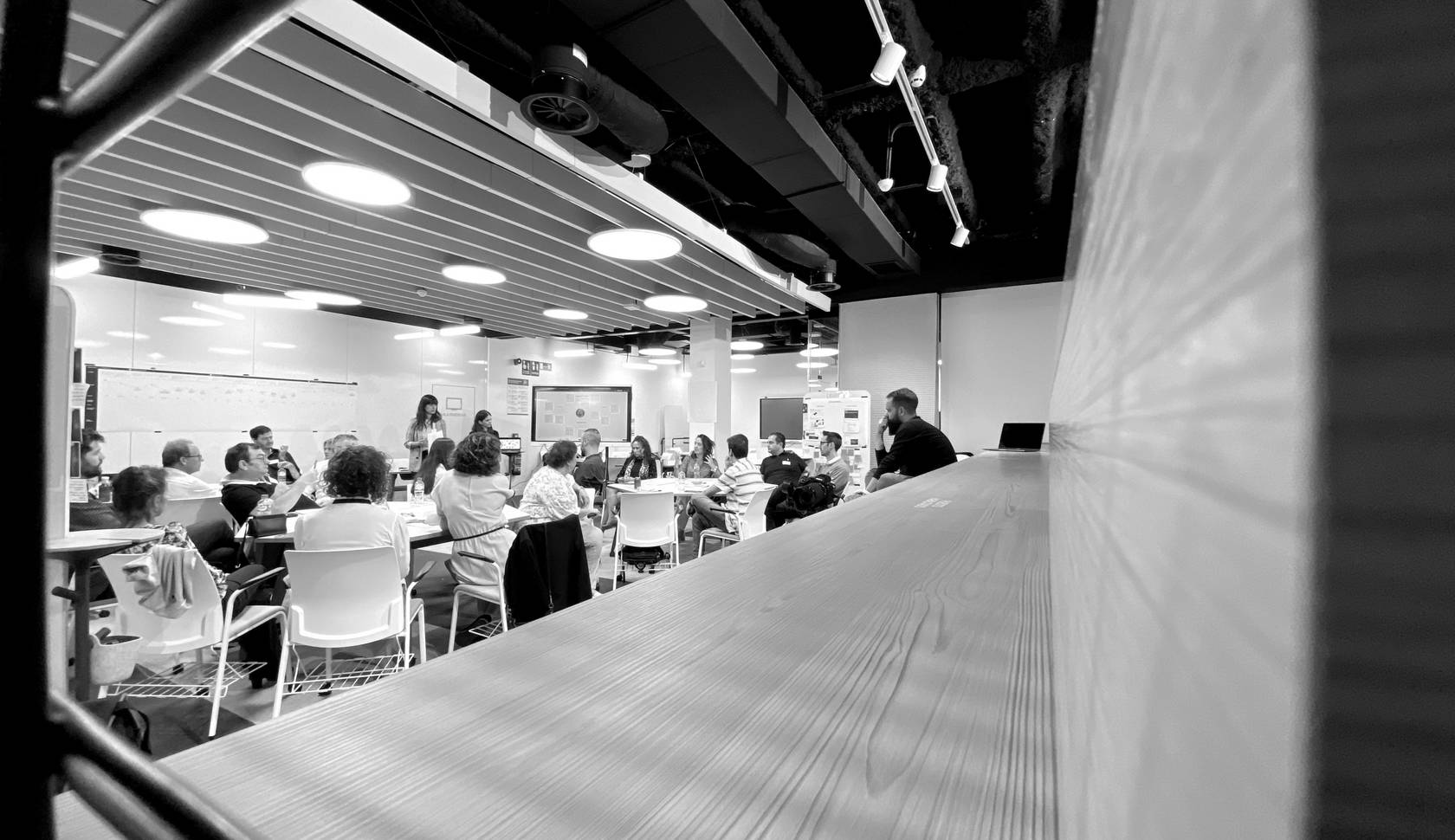

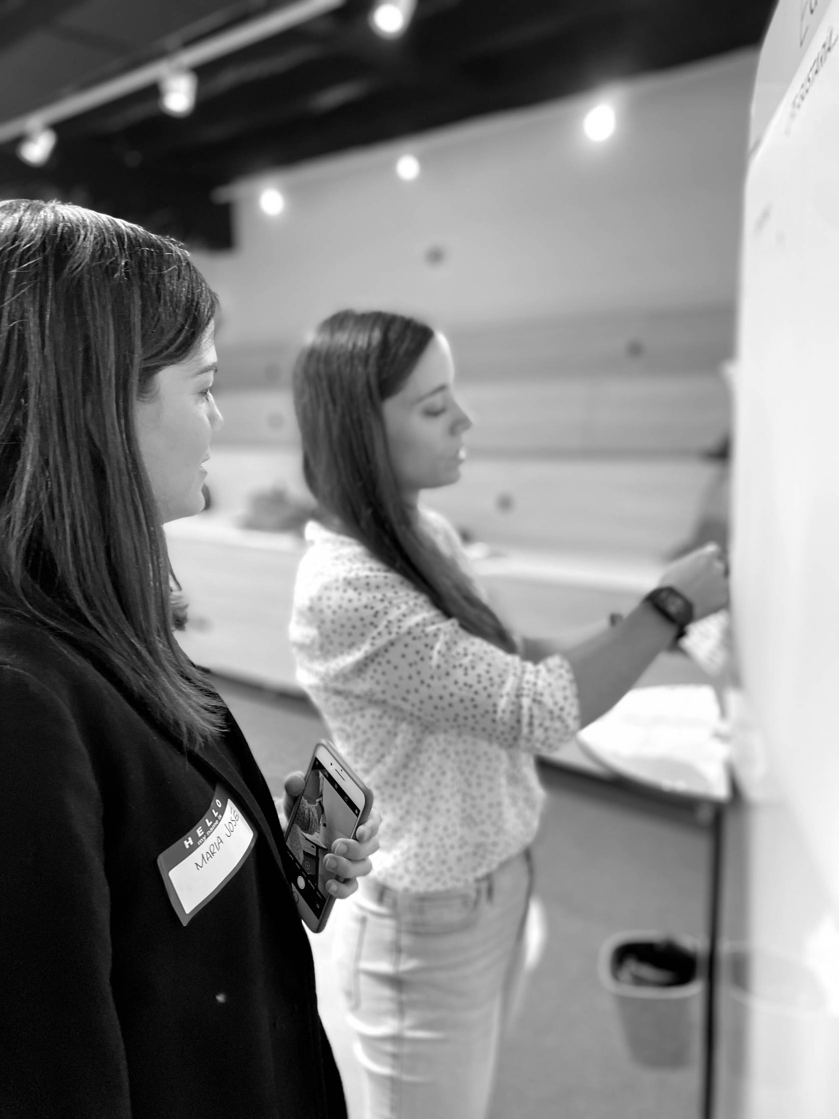

The process mapping and the architecture and flow analysis were one of the most demanding activities in the project, both in terms of collaboration and effort. But they were essential to discover they key aspects to improve in terms of UX, UI, accessibility, tone...
Challenges
Improving OKRs through a dual approach
The research shed light to the need for change from multiple angles. To drive this, we decided on two very important archetypes of the institution's audience: how to capture the attention of the international student and how to connect more strongly with the current student.
Based on the findings identified, we undertook a significant transformation of the brand image and communication tone of the entire institution. This change not only refreshed the look and feel of Comillas' recruitment strategy but also reinforced a commitment to being relevant and valuable to today's audience. As such, this redefinition of the brand allowed for greater identification with the values and goals of today's students.
In addition, adapting the structure and content to create a more user-friendly digital environment tailored to students from all over the world makes it easier to attract more international students by providing them with a more effective experience of considering the University.
The modernisation of the corporate image, the optimisation of the web architecture and the improvement of performance have all contributed to an enhanced user experience and a stronger and more competitive digital presence.
Web assessment

The strategy: achieving one voice


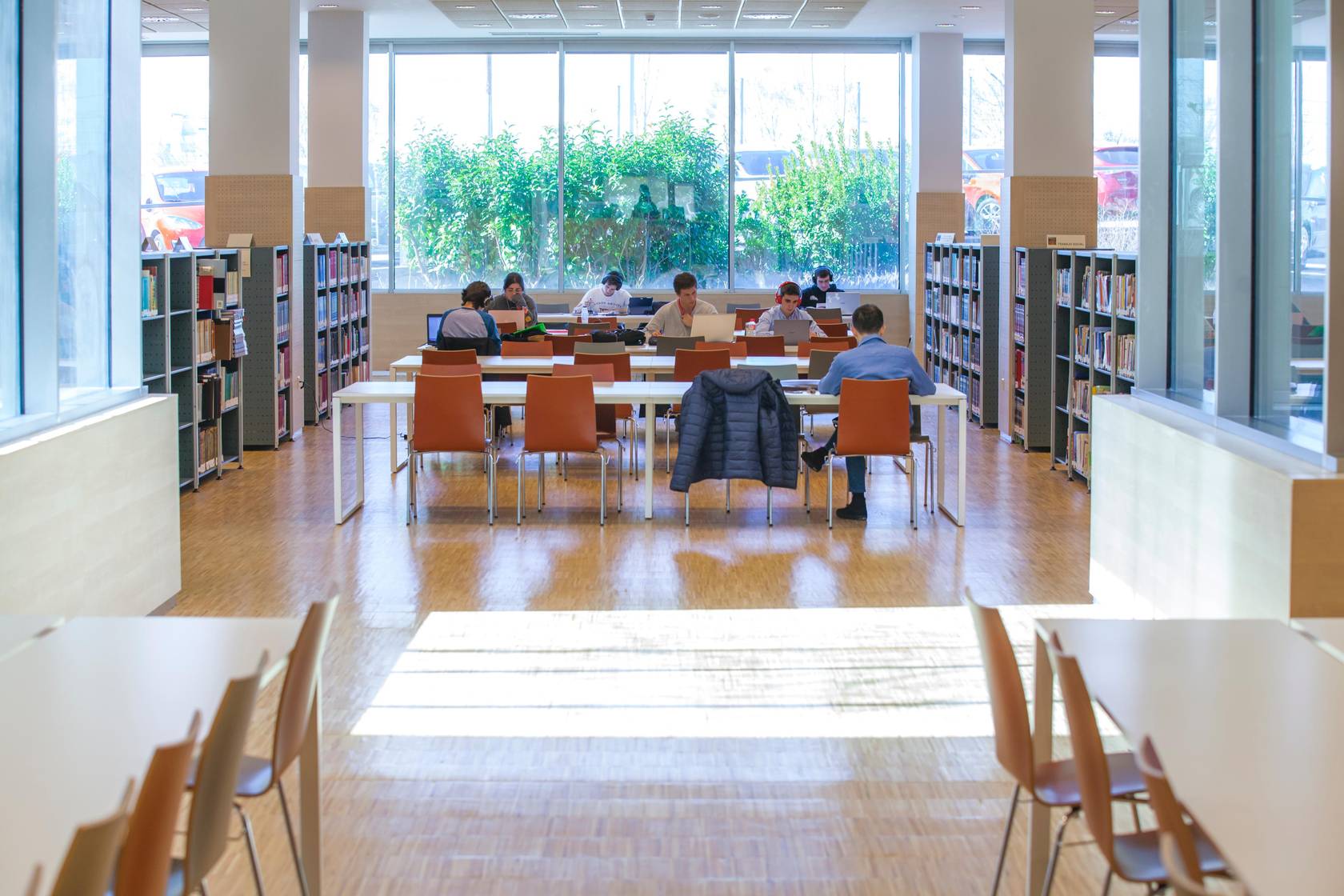

Comillas is the umbrella brand of the institution, but people recognise much more some of its entities that operate as if they were own brands.
Visibility and consistency for all houses
ICADE, ICAI, they sound familiar, don't they?
In the research phase, we discovered that most people knew these "brands" even better than Comillas, they wanted to study at ICADE, they wanted to be ICAI, and at a branding level, without a doubt, we detected an opportunity. Even more so, taking into account that each of these entities had its own logo and its own identifying colour.
On the other hand, it was important to take into account the complex structure as a whole, as well as the "sub-brands" of faculties and schools, which includes institutes, our own and affiliated centres, as well as chairs, agreements...
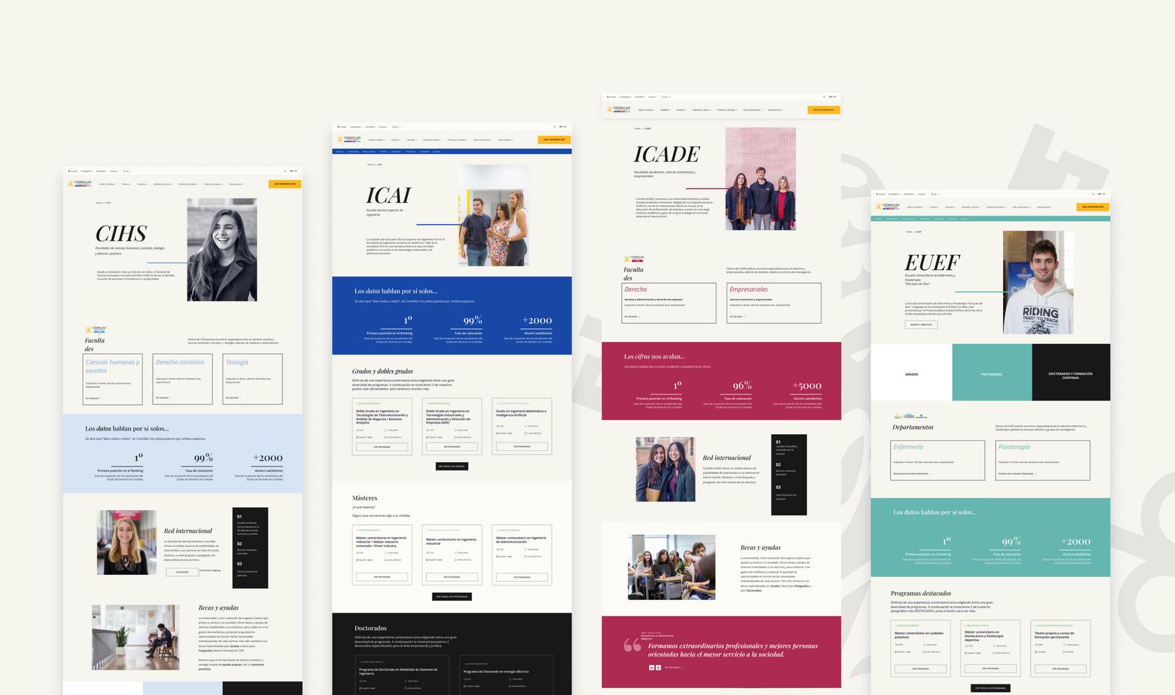
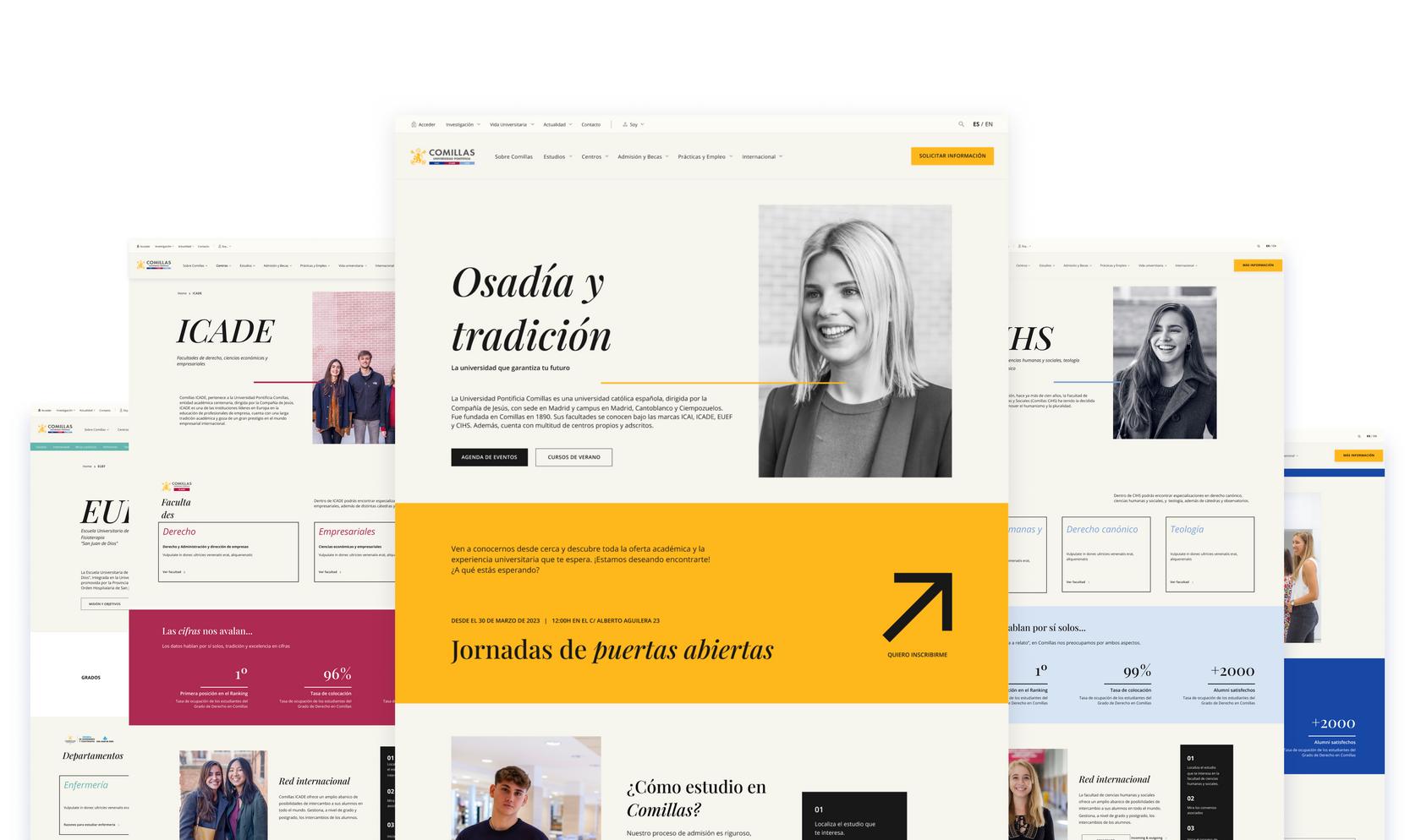
The solution to the intricate problem was to apply different highlight colours, both to enhance the sub-brands and to orientate users, as there were so many URLs and so much content on the website, and the lack of coherence contributed to user disorientation. Thanks to the contrast obtained, navigation and orientation was solved, a significant visual improvement and we achieved an equitable representation between the faculties and schools so that all areas felt integrated.
Modernisation of the corporate image
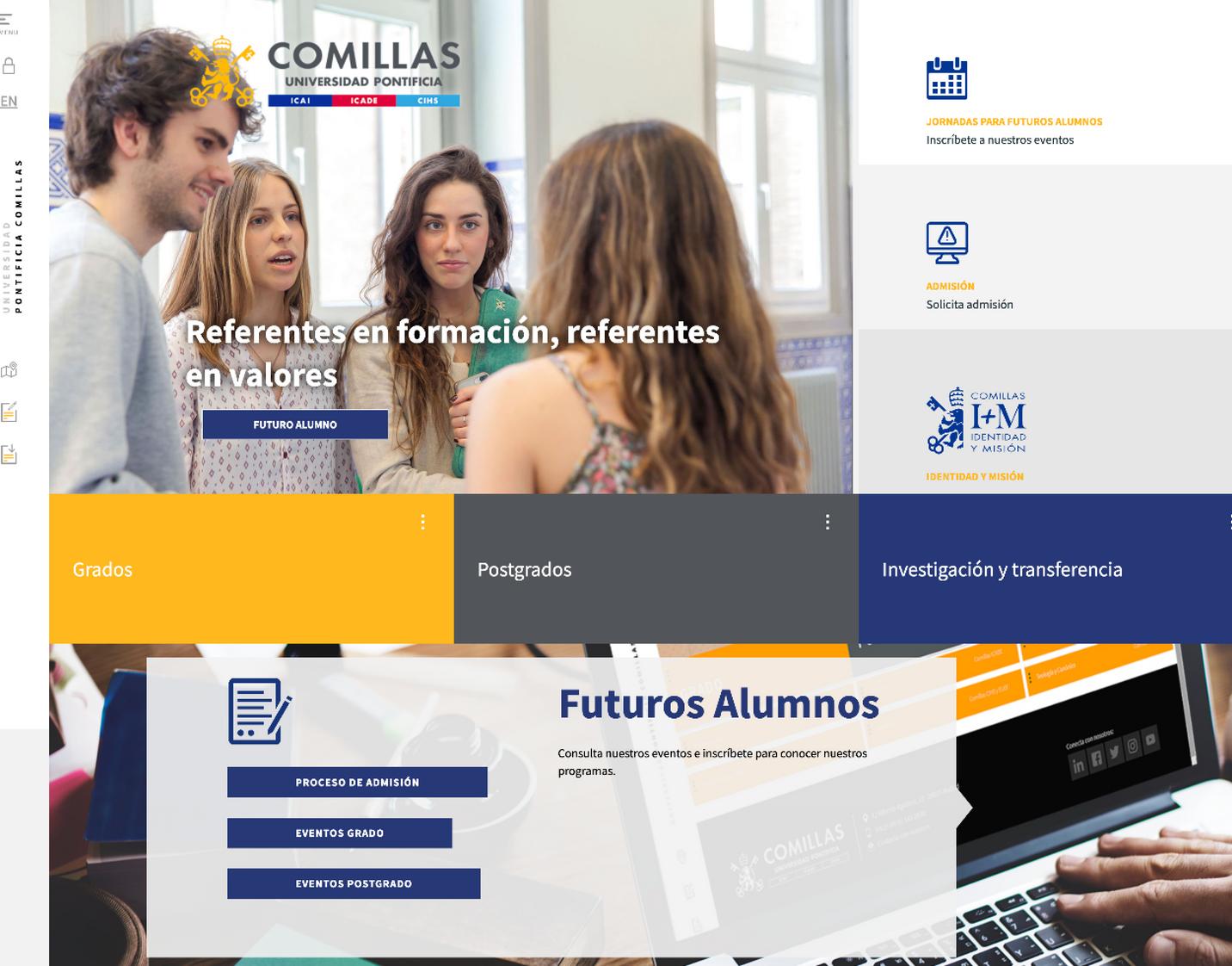
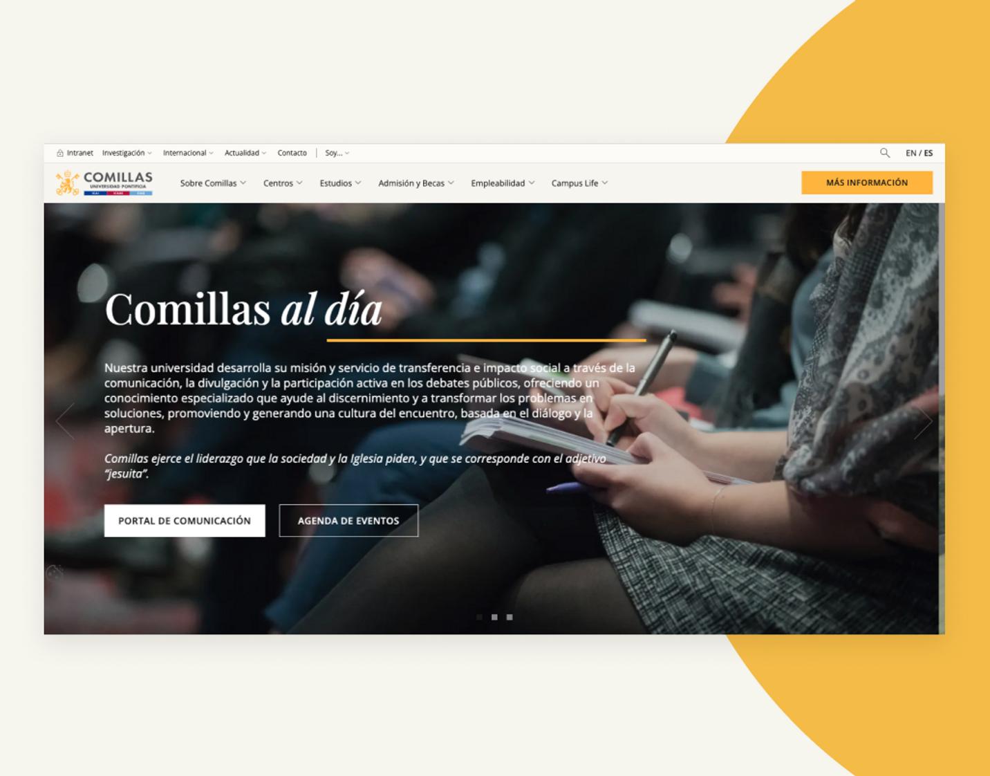
In our commitment to deliver a unique and memorable experience, we embarked on a bold journey of visual redefinition. Breaking with ingrained preconceptions and challenging the traditional, conservative style that can sometimes surround the academic environment, we ventured into uncharted territory in order to achieve a design that was totally atypical for the education sector.
We worked on a visual line that could set the institution apart from what was known but keeping the brand within the category, that fulfilled functional expectations and attracted the user's attention, and that invited them to continue reading, discovering and immersing themselves in the Comillas' website, until it led to an application for admission.
The collaboration between the different teams and meticulous attention to detail led to outstanding results: a clean and attractive design was created that captured Comillas' identity in a way that was up-to-date and consistent with its mission and values, while presenting it in a contemporary way.
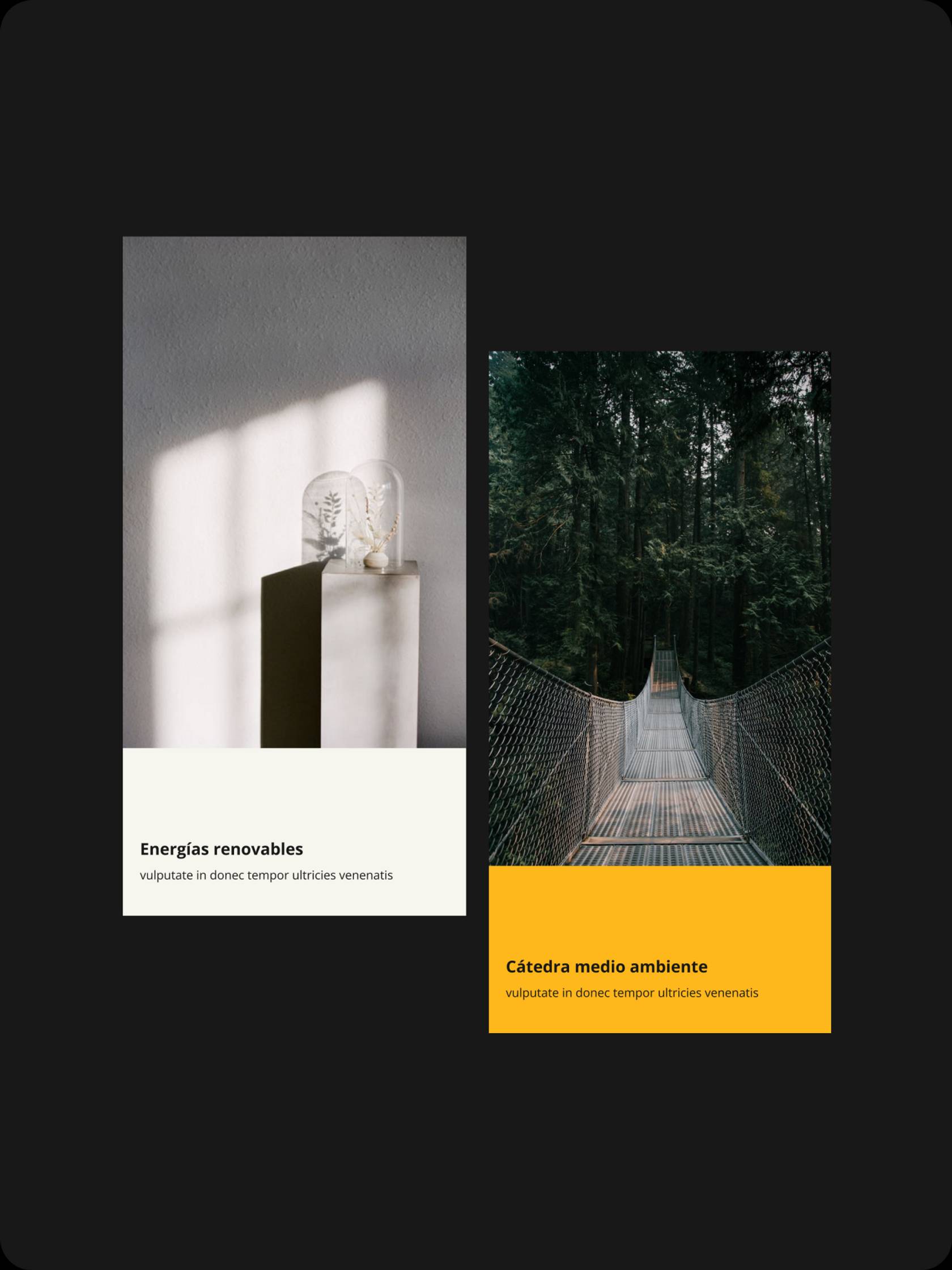



Elegance and disruption
The main function of the visual identity is to modernise and revitalise the digital presence of Comillas, transmitting its trendy, current, young and digitalised character. In addition, the definition of the visual identity had to go beyond the digital and permeate the physical.
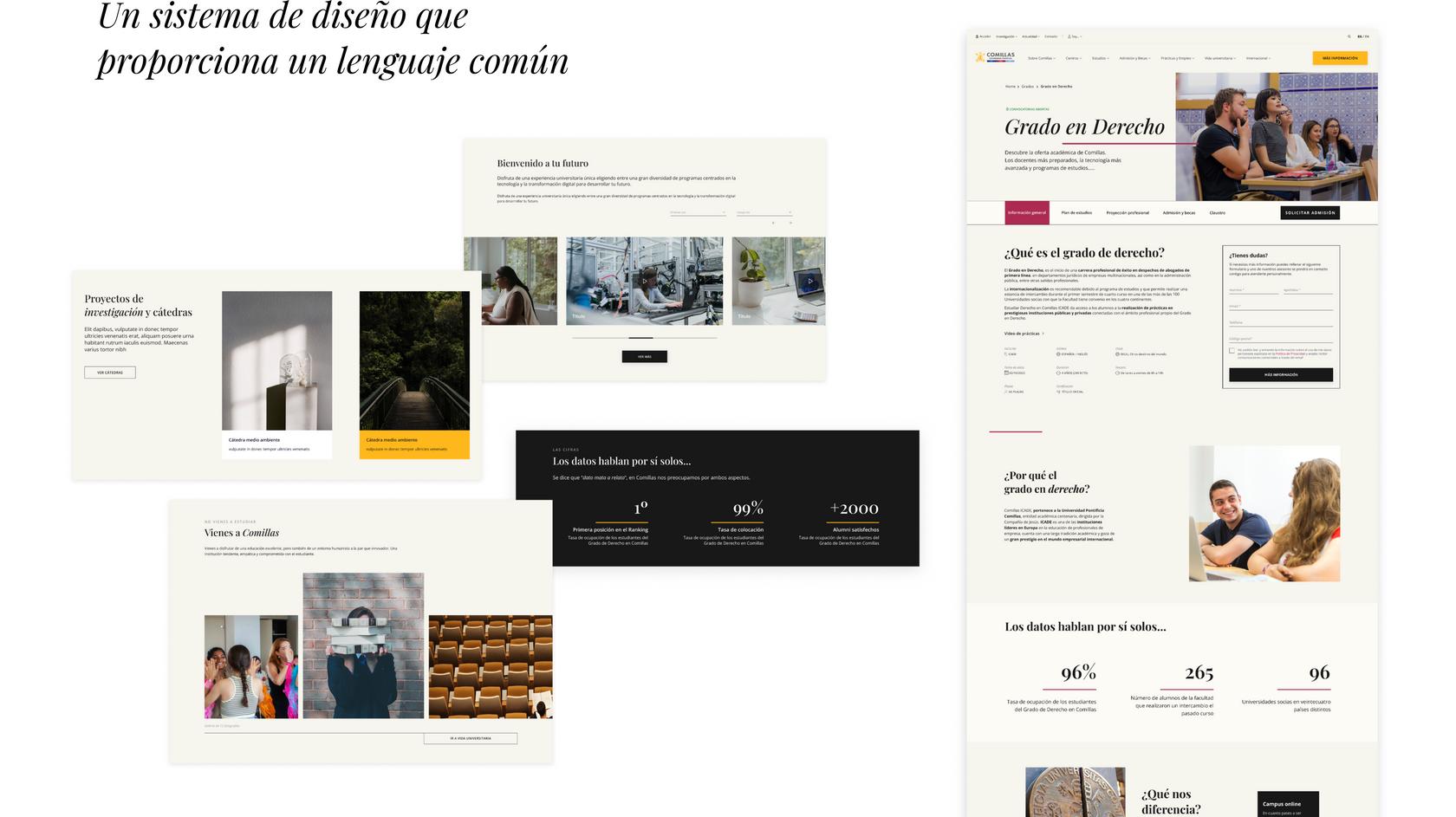
We defined a line with a minimalist and editorial character, in which we relied on more usable and current interactions, as well as with more daring elements that could offer character and distinction with respect to what is usual in a university website. The difficulty was to find the necessary balance to maintain the sober and rigorous aspect that an institution like Comillas should transmit.
Typographic foundation
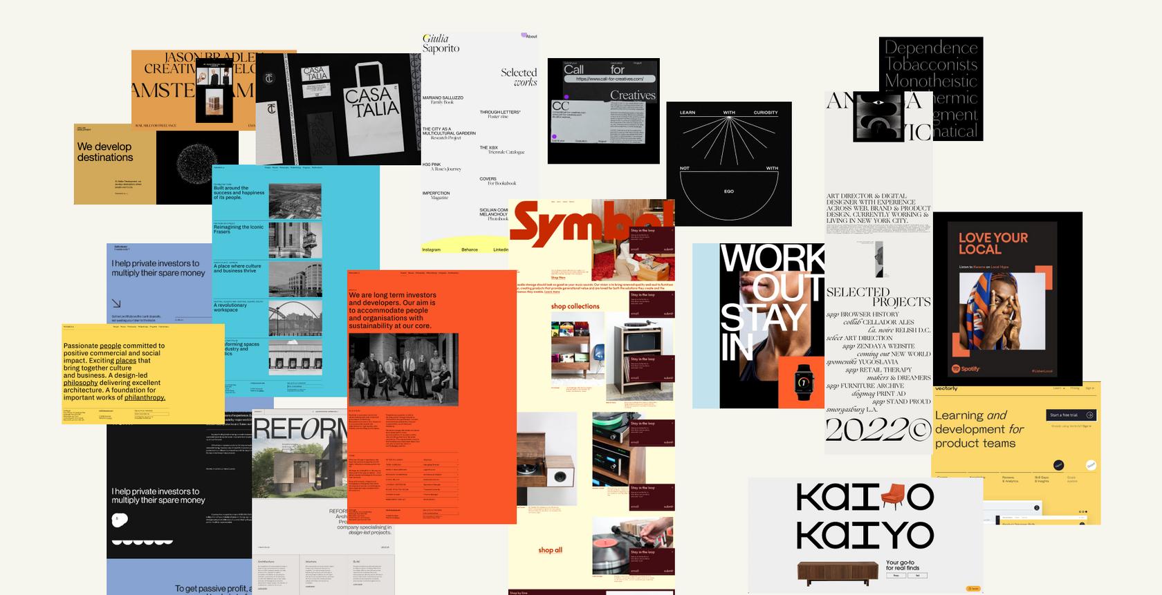
To build a brand, we rely on the most prominent resource in communication: typography.
Typography is the identifier that has the most presence, and with which we interact most frequently, deeply and consciously. Therefore, we seek a balance between the classic and sober typographic style and the need to instil elegance and modernity, looking for a friendly and dynamic effect.
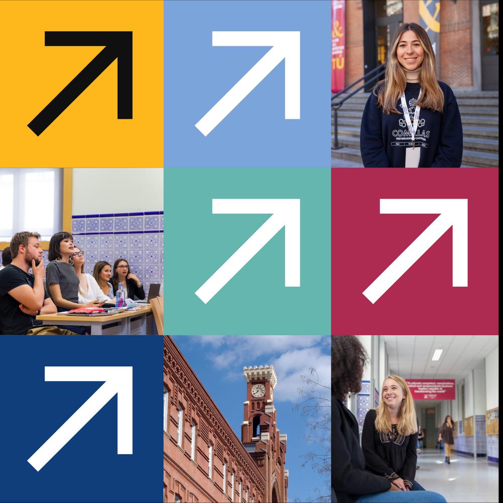
To complete the visual language, we immersed ourselves in the world of iconography, looking for simple shapes, traced with a simple line, with no mass, and easy to understand.
The combination conveys a sense of boldness and innovation, of being an attractive institution not only for its prestige and tradition, but also for its topicality and boldness in always taking risks for a common good, a social good.
The compositions with logos, colours, typographies, icons, photos, using a variety of shapes and sizes manage to create a harmonious structure that meets the needs and appeals to the appetites of internal and external users, and also exceeds the expectations of visual style.
Web architecture
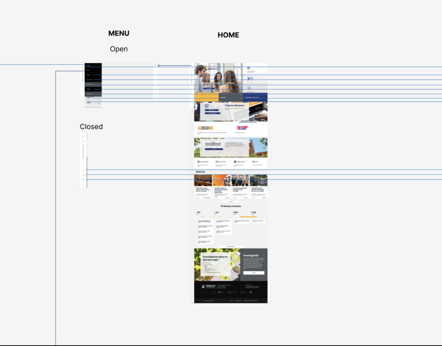
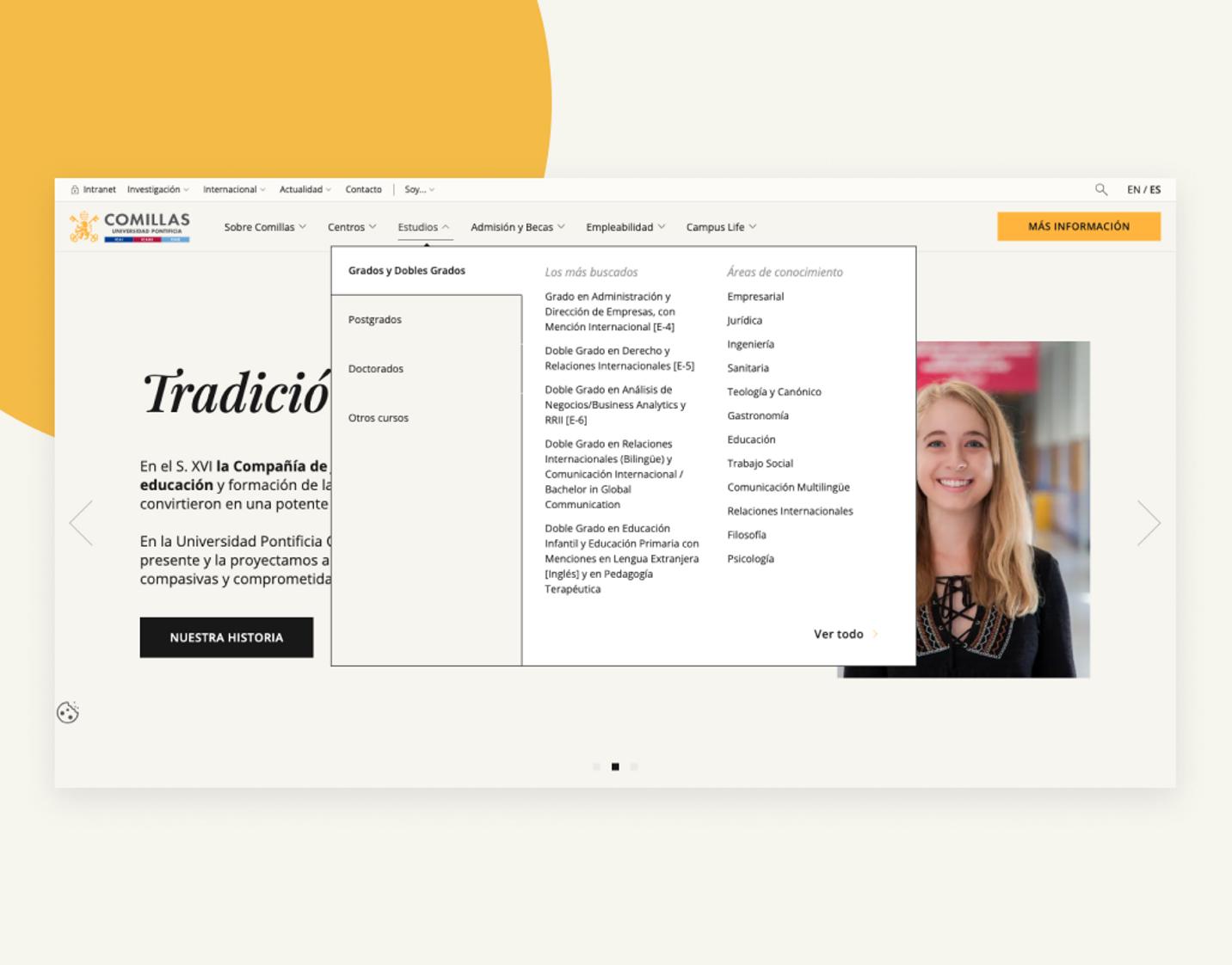
The new web architecture has improved navigation, making it easier for visitors to find the information they are looking for quickly and easily. Intuitive navigation and hierarchical structure have been prioritised , ensuring that important information is easily accessible.
In addition, the content team has worked to review and reorganise existing pages, reducing unnecessary content and ensuring that key information is presented clearly and concisely.
The 35% reduction of content in the number of pages has allowed for a more effective presentation of information, avoiding content overload.
Griddo, the key to integrating and crystallising all work
Griddo, Secuoyas' proprietary DXP, is the secret sauce for giving us the ability to coordinate strategies, synchronise efforts and boost the efficiency of all parties involved, from SEO optimisation to the integration of the brand, marketing, technology and educational product team efforts.
Centralised site management, an integrated design system that ensures an excellent brand experience, and the autonomy to create and publish any type of content are some of the many advantages offered by this powerful Cloud platform.
Coordination between the design and development teams has been crucial from the start, both to carry out the integrations with Comillas' CRM, in order to connect withthird partydata sources, with the AppCrue, and to implement the technical functionalities required to support the new design and site features.
Modular design
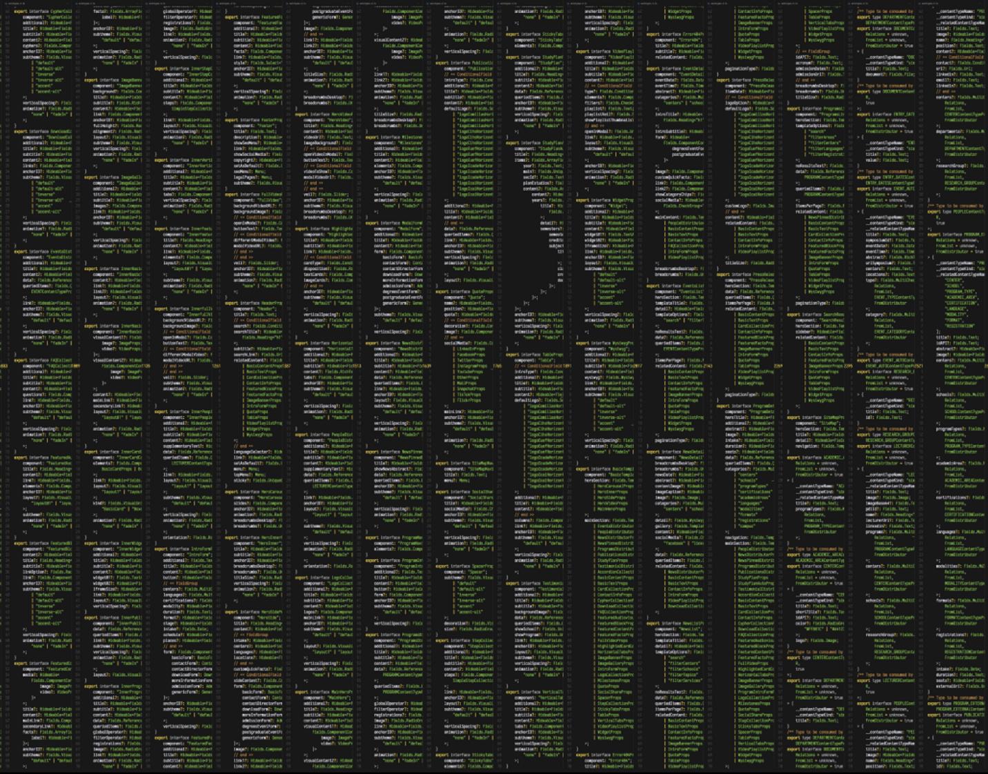
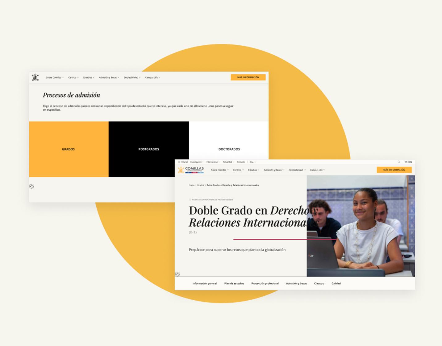
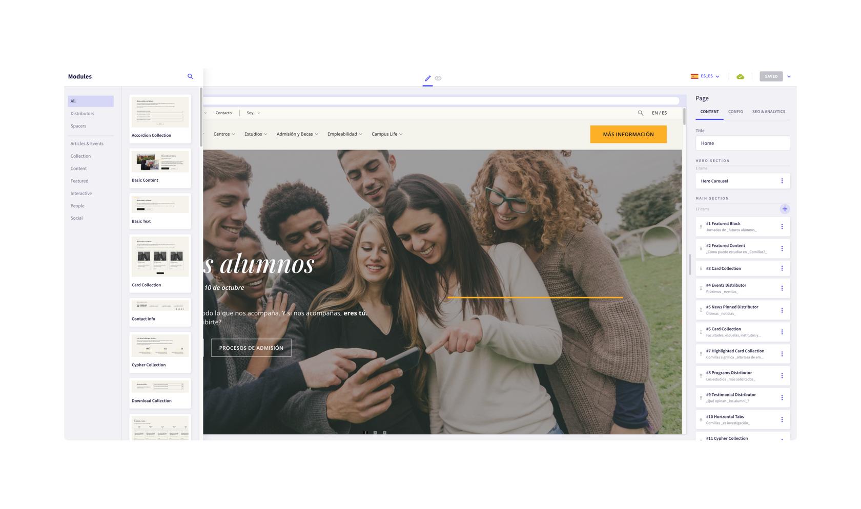
With a modular approach, we have managed to overcome the traditional limitations of web design and transcend conventional boundaries. Thus, each module, each element and each component becomes a piece of a puzzle, that the user can adjust, rearrange and customise as its needs evolve.
Whether creating a product page, adding a new site or launching a landing page, the integrity of the brand remains intact, ensuring a consistent visual and conceptual experience.
Responsive design
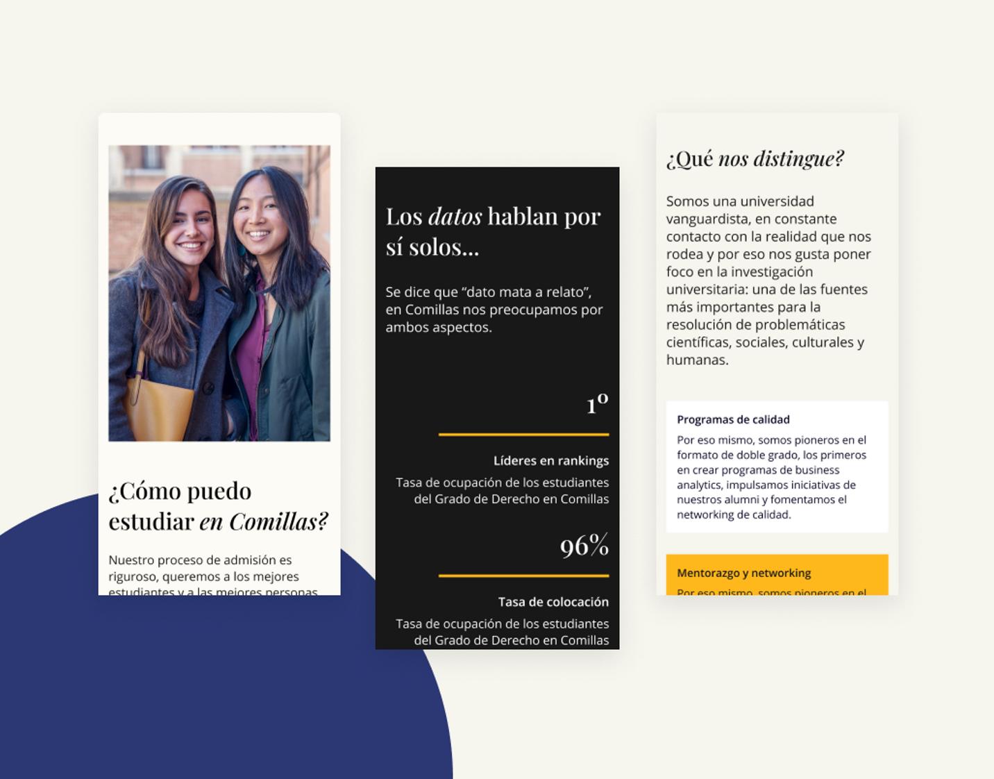
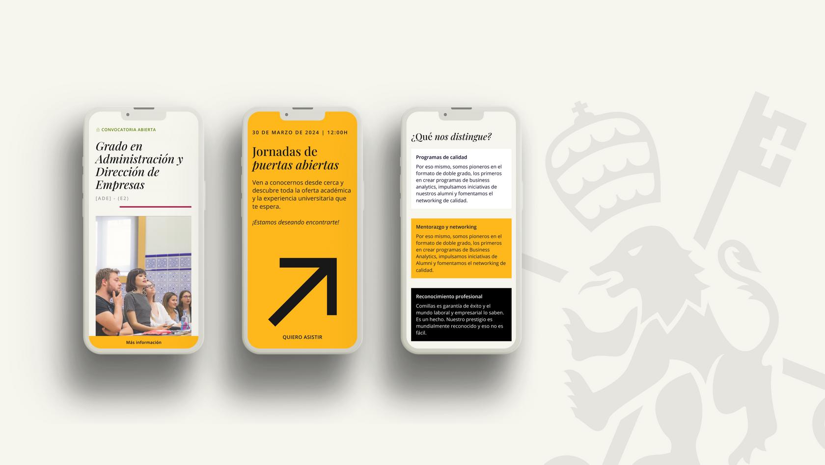
Another essential element that makes the difference is the implementation of responsive web design, which allows us to reach a diverse and constantly changing audience.
The adaptability to any type of device or screen ensures that students, parents, teachers or any member of the university enjoy an optimal and unobstructed experience, regardless of how and when they access the content.
Performance, optimised
85
Performance Index
80%
Reduction of loading times
85%
Improved pages according to Search Console
1,8s
LCP (Largest Contentful Paint)
New school year, new website
The continuous twelve-month collaboration between Secuoyas' multidisciplinary team and Comillas University has resulted in a successful digital transformation of their institutional website.
The modernisation of the corporate image, the optimisation of the web architecture and the performance improvements all contribute to an enhanced user experience and a stronger and more competitive online presence. This success story stands out for the elegance of its design, careful planning and efficient execution that have achieved impactful results while improving the pre-established deadline.
